TYPEWRITER of the MONTH

1956 Everest K2 Typewrier - Wachtendorf Collection

August 2016: 1956 Everest K2

The Everest K2 is one of those love/hate models that polarizes opinion and slots owners into one of two opposing camps, and any machine that can stir up such debate is a perfect machine for TYPEWRITER of the MONTH.

The majority of K2 detractors grumble about lacklustre performance, claiming the typing experience is more similar to trudging through valleys than soaring above peaks. My own experience with the typewriter has proven the opposite: Not only does the Everest portable type well enough to satisfy the most pedantic requirements, it also provides a taught and concise feel that turns the keyboard exercise into an enjoyable interaction.

K2 is the second highest mountain in the world after Mount Everest, which might lead you to think that the typewriter physically towers over the competition, but a measuring tape proves that it’s actually an average size for a portable. A more likely explanation for the mountain-inspired name would be that its form, much like the snow-capped peak of K2, is simply something beautiful to look at. How typical of Italian industrial design that you can find yourself appreciating the view even more than the performance.

Article: Bargain Basement


>    

      It may not be the stuff of collectors’ dreams, or enough to even garner more than a passing glance from a would-be buyer, but in the practical world bargain basement typewriters can be as valuable as the most prized machines owned by collectors and aficionados.


Pity the undesired typewriter, lowly machines that fail to meet the standards of collectors who are only interested in unmolested thoroughbreds, not broken-down plough horses – even if those seemingly lame specimens are still perfectly capable of performing the job they were designed for. Fortunately there are those who celebrate the workhorse, buyers who aren’t as fussed with display pieces; after all, once you remove fastidious filters such as branding, colour, aesthetics, and perceived rarity, you still have typewriters that are equally efficient at putting words on paper.


Rust, flaking paint, and broken and missing parts are details that cause some collectors to recoil in disgust, but for typewriter buyers who actually value performance above all else, battle scars and hard-earned patina are the qualities that make castoff models so alluring. A fussy collector’s loss is the gain of buyers who appreciate blue collar machines, because banged-up typewriters found on the shelves of charity stores and in yard sales tease their imagination, cause them to speculate about the machine’s history, and make them wonder who they served and in what capacity they were used.


Unloved by many, perhaps, but still full of life, these are the machines that deserve to be returned to the ranks of working typewriters. And if there was ever a sign of a well-built typewriter, it’s one that still performs in an exemplary manner despite having obviously been subjected to physical abuse. 

Bargain Basement Typewriter
Smith-Corona Classic 12

>

This Smith-Corona Classic 12 is a perfect example of the typical reject: Its storage case long lost and the carriage a victim of blunt force trauma, there’s no question that it’s had a hard life, and yet everything works as it should and the machine still types like the day it was first used. The Classic 12 is a well-respected model, its popularity proven by a lengthy production run of some twenty years, and given how many are still available today, it deserves to be regarded as a venerable typewriter; and as its apt name suggests, it’s a classic, a possible candidate for the acme of Smith-Corona’s portable model production history.


The model’s history aside, it’s the outwardly poor condition of this particular Classic 12 that sparks curiosity and makes it a worthy purchase. It’s impossible to know whether the machine’s many flaws are the result of one cataclysmic event or the subject of numerous smaller careless actions, but what is more certain is why it was fitted with apothecary Changeable Type characters: an inventory sticker on the side of the typewriter indicates that it had once been the property of a children’s hospital. Also noteworthy, the original protective shipping tape is still affixed to the case; why it had never occurred to the first (or any subsequent) owner to remove it is a matter of speculation, but it adds to the unique character of this survivor.


Thirteen dollars doesn’t buy you a lot, certainly very few items that will last for any length of time, but remarkably it’s enough money to buy a fully functional typewriter. It may look like it was put through the wringer, and it might be in need of a few small repairs (and a lot of cleaning), but for many typewriter enthusiasts such work is typically viewed as being a rewarding experience. When placed in perspective, thirteen dollars is an obscenely modest amount of money for such a practical and powerful tool, one that arguably is better representative of the typewriter century than any of the pristine and sterile dust collecting exhibits cherished by so many connoisseurs.

Smith-Corona Classic 12

>

Not just missing a platen knob, the entire end of the shaft was somehow snapped off the carriage. 

Smith-Corona Classic 12

>

Top Left: The bad side. To be honest, there isn’t a good side, but it works well and that’s all that really matters. 

Top Right:  Protective shipping tape still attached, after been on there for all these years I don’t have the heart to pull it off. 

Smith-Corona Classic 12 - the bad side
Smith-Corona Classic 12
1970s Smith-Corona Classic 12 - Type Sample - Wachtendorf Colle

_

>

Battered and beaten: It has bent levers and a number of keys that are out of place, but there’s nothing there’s nothing wrong with the alignment on the page. 


TYPEWRITER of the MONTH

 1955 Underwood Universal

July 2016: 1955 Underwood Universal

From the mid to late ‘50s Underwood displayed what appeared to be a scattered, if not manic approach to the design of its portable typewriter cases. Four different designs existed over the five year span, and even the Underwood logo that badged each machine seemed to be the subject of a constant evolutionary flux. In hindsight, when you factor in the company’s close association with (and eventual takeover by) Olivetti at the end of this period, it’s easy to view this chapter in Underwood’s history as the death throes of the company’s identity.

The ranging designs from this era included everything from curvy, deco-inspired shapes, to pragmatic and stoic enclosures. Occupying the middle ground of these design extremes is this ’55 Universal with its white enamel front cover that makes the typewriter look it belongs alongside the stoves and fridges found in American kitchens during the nifty fifties. It was daring for Underwood to present the typewriter as an appliance, and the distinctive design earns this Universal Typewriter of the Month honours.

TYPEWRITER of the MONTH

 1957_Smith_Corona_Super_-_Wachtendorf_Collection

June 2016: 1957 Smith-Corona Super

This top model of the ubiquitous Super-5 series arguably represents the zenith of Smith-Corona’s portable designs, and yet it is often overlooked by today’s typewriter buyers. Despite its remarkable performance characteristics, and a proven record of robustness, most contemporary buyers only see a machine’s aesthetics, which is perhaps the only fault to be found with the Super-5 typewriters.

In isolation the Super-5 design is wonderfully organic and streamlined, but much of its nuanced details are lost in the drab colour palettes that Smith-Corona used for the majority of Super-5 models it produced. The bland brown-grey-green paint covering most Super-5 models effectively turns what is a sexy typewriter into a stodgy-looking machine, but not so with this ’57 model, which is one example of the less frequently seen colour variants. Literally rocking the Super design, this lava black finish with light grey accents and ivory-coloured plastic is transformative, and it makes this machine worthy candidate for Typewriter of the Month.

First Impression: Olivetti Lexikon 80E

Olivetti Lexikon 80 Elettrica

Model: 1958 Olivetti Lexikon 80 Elettrica [1069991]
Production Run: 11 years (1950-1961)
The Competition: Olympia SGE; IBM Model C
Significance: Olivetti’s first electric typewriter


“Are you sure?” the text message asked. It was easy to identify the second-guessing that was going on between the lines of the message sent to me by a fellow typewriter collector.  A man of immeasurable luck when it comes to finding typewriters in such places, he had stumbled upon an Olivetti Lexikon 80E in a thrift store, and thought that I might want it; however, it was only now that he began to fully grasp the Olivetti’s imposing mass, and the distance he would have to carry it to his car was weighing heavily on his mind.

“It won’t power up,” read a subsequent text. It was obvious that he was attempting to talk me out of the deal, but it was too late: Whether or not the Olivetti worked was of little consequence to me, the significance of the model was simply too great – I had to have it.

Post-war Olivetti typewriters, much like fashion supermodels, only hold a superficial appeal for me, and as a result I don’t buy Olivetti typewriters for the way they type, but solely for how they look. The keyboards of the ultra-portable models are awkward to use for my large-size hands, and I’ve found that the full-size portables typically have wooden, erring on heavy type actions. Most disappointing for me are the standards: From a purely performance perspective, the Lexikon through to Linea 88 model range is a group of underachievers when compared to other machines from the same era.

Olivetti Lexikon 80E Top View

This disparity between visual and mechanical execution can be blamed on Olivetti’s fixation on transforming typewriters into objects of style. It’s no secret that Olivetti as a corporation was obsessed with the aesthetics of everything under its control. Regardless if it was the design of its office buildings or the look of its promotional materials, Olivetti, more than any other typewriter manufacturer, wanted to ensure that a visual statement was being made. Proof of this was Marcello Nizzoli, the company’s chief design consultant responsible for the Lexikon models. The graphic designer started with the company in an architectural and publicity role before designing actual typewriters, some sources even claiming that he was more concerned with the appearance of a typewriter than how it actually worked.

The result of this passion is undeniable, and Olivetti designs are so evocative that you can’t blame a typist for expecting a superlative experience when using one, or to feel let down when the experience turns out to be average at best. Against the seemingly endless backdrop of staid and stereotypical typewriter designs, Olivetti models more than any other stand out from the crowd. As a collector I’ve come to appreciate Olivetti models for their strengths, which are bold, sometimes daring designs that you want to own just for their looks and to hell with how they actually type.

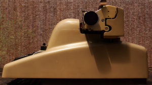
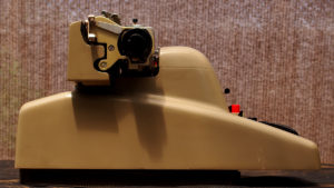
This is where the Lexikon 80E steps into the conversation. Its wonderfully bulbous lines are reminiscent of a Rubenesque woman, and yet its design somehow manages to belie its true girth and one has to applaud the machinations responsible for concealing its heinous mechanical complexity in such a pleasing form.

Bellissima Famiglia: The Lexikon 80E aside the 80 and Lettera 22.

Particularly when juxtaposed with a Lettera 22, or even a standard Lexikon 80 for that matter, it’s easy to appreciate the artistic effort that went into creating Olivetti s first electric typewriter. Arguably, the only real downside to this electromechanical sculpture is its weight, and because of it my friend had good cause to try and renege on his offer. I imagined that when he was finally forced to carry it out to his car it must have felt like he was carrying a limp body out of a fire. When it was my turn to handle the Italian leviathan, my typewriter scale was its first stop. My eyebrows raised when I watched the scale’s spinning dial stop at 59.2 pounds (26.9 kg) and I realized that the Olivetti was a full four pounds heavier than the reigning heavyweight in my collection, the Olympia SGE 50/51. Those fortunate enough to find an 80E fitted with the optional carbon ribbon system would have a 60-plus pound machine to contend with, and a good reason to cancel their gym membership.

After a cursory cleaning and having satiated my initial desire to just enjoy the view, I moved on to more practical matters and plugged the machine in. My friend had not lied, it didn’t work. The problem was quickly diagnosed, and with its defective power cord repaired the Lexikon fired to life. To my relief everything functioned as it should, and although the machine types willingly there is an odd clunking sound coming from underneath the hood that will require further investigation.

While testing the machine it became obvious that its electromechanical mechanism was a great equalizer, and that this Olivetti standard was endowed with the best of both worlds: it had both beauty and performance. The inherent characteristics of the electric typewriter addresses my biggest complaint with mechanical Olivetti standards having disappointing type actions, and to steal and adapt a little Hunter S. Thompson, the Lexikon 80E’s typebars leap up with the slightest touch of its keys like frogs in a dynamite pond. For someone who would have considered a non-functional electric Lexikon money well spent, this was purely a bonus.

Atlas may shrug at all this mortal prattle, but I consider the Elettrica Lexikon a must-have for any collector whose appreciation of typewriters transcends the practical and enters the realm of art.

the Details: Olivetti Lexikon 80E

Olivetti Lexikon 80E FrontOlivetti Lexikon 80E Keyboard
Olivetti Lexikon 80E RightOlivetti Lexikon 80E Left Side
Olivetti Lexikon 80E Ribbon SelectorOlivetti Lexikon 80E Paper Table
Olivetti Lexikon 80E TypefaceOlivetti Lexikon 80E Impression Control

1958 Olivetti Lexikon 80E - Type Sample

Picture Perfect [01]

1962 Facit Postcard

Sexy Swede?

It might not exactly be an example of typewriter porn (yes, collectors actually use the phrase), but this postcard that features a model seductively draping her arm around a Swedish-made FACIT T1 is a curiosity.

The T1 is not exactly an attractive machine, and it makes one to wonder if the postcard shouldn’t have been titled Beauty and the Beast.

You would think that the card, which is postmarked July 1962, was a promotional item from Facit, but it doesn’t have the company name anywhere on it. If this was supposed to be a form of advertising, it wasn’t a very effective one. And if not advertising, does it suggest that there was actually a demand during the ’60s for postcards that featured women posing with typewriters?


TYPEWRITER of the MONTH

 ClackAttack - 1946 Smith-Corona Sterling - TOM

May 2016: 1946 Smith-Corona Sterling

It’s only fitting that the very first Typewriter of the Month should be the first typewriter I ever bought. Every time I pull this machine off the shelf I pause to reflect on the role it played in kick-starting my fascination with typewriters, and how things could have turned out very differently: Had this Smith-Corona Sterling not been such a gem to use, it’s very possible that my current obsession would have been stillborn, and that I would have never followed up this typewriter with another machine.